Adler Planetarium
When I arrived at the Adler Planetarium in 2011, the museum's design aesthetic was what you would expect from a space science museum—dark colors (mostly dark blue and black) and "futuristic" typography with shiny, metallic bevels. So many bevels.
Our design team set out to help define what the Adler experience was, and how we could represent that experience visually across a huge variety of channels.

The inspiration
Adler History
The planetarium itself is an iconic point of reference for the brand we established. The building's art deco architecture and famous zodiac plaques by Alfonso Iannelli provide inspiration for the line and form choices we make with respect to grid systems, typography, and illustration.
Science Fiction & Popular Culture
Sci-fi and pop culture shape how the public views space. We love the charm and excitement of comics, classic movies, and 1950s and 60s advertising. We took note of these media's bold use of type, and their stylized depictions of space environments and explorers.
Current Science
Space doesn't need to be depicted as a dark, black void. The Adler’s color palette is inspired by our own galaxy—specifically, what our Milky Way looks like in the infrared spectrum through the Spitzer Space Telescope.
The system in use


Adler After Dark
Our Adler design team worked hard to develop brand guidelines to adhere to. Once a month, we’d throw them out the window—in the name of experimentation! Each Adler After Dark—a 21+ monthly evening event—had a different theme, requiring us to flex new design muscles. Sometimes that meant going super Swiss ... and sometimes that means glitter typography.


Exhibits
Moon and Earth stairwells


Mission Moon redesign
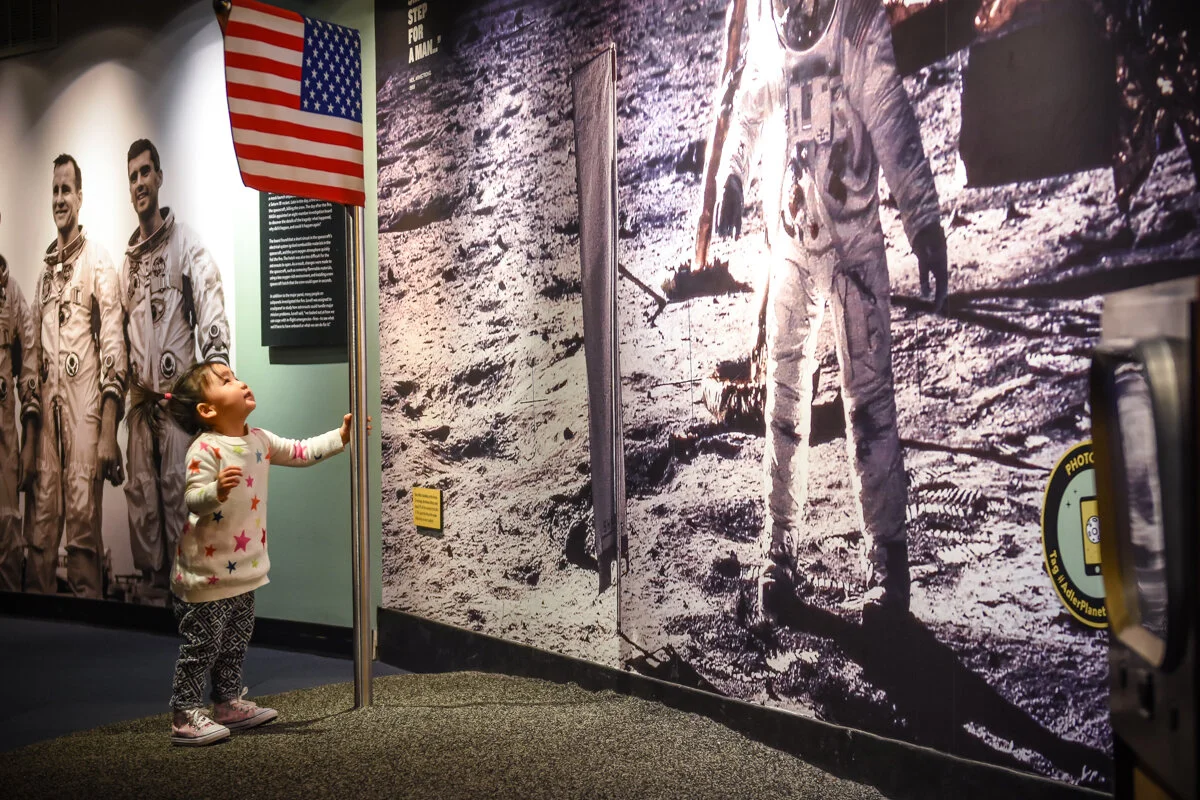
A small budget and a tight timeline meant our team needed to be creative. The biggest visual transformation was achieved with paint. Color was used to denote zones throughout the exhibition and to bring attention to key elements, interactions, and artifacts. Even artifact case interiors were painted for increased contrast.
The majority of the graphics were printed and assembled in-house. NASA archive imagery—often too small to scale up to the necessary size—was converted to a halftone pattern and enlarged. This fit stylistically with the time period of the exhibition, and hid compression and image-scaling artifacts.
We paid special attention to increase overall accessibility in the gallery. Typographic treatments were updated to adhere to more rigorous visual standards for size and contrast. Physical interactives were created to accommodate folks of many abilities. A ramp was built around the Gemini 12 Spacecraft to ensure guests of all ages, heights, and abilities could get a closer glimpse of a truly remarkable historic artifact.

Top (left to right): Demolition of Shoot for the Moon begins; A ramp is built around the Gemini 12 Spacecraft to allow for more accessible viewing of the artifact; Exhibit technicians begin painting the galleries; An old case is repurposed as a display for Mission Control photographs and paraphernalia; Case maker Earl Locke begins artifact case installation.
Bottom (left to right): Once-static Mission Control consoles are wired for lights, audio, and functional switches; The Collections team places artifacts into cases and touches up labels; A new exterior banner goes up on the side of the planetarium; Actor Chris Bresky develops a museum theater piece in the newly completed Mission Control; The first guest attempts to launch a rocket.